The principle is the same, otherwise a lot is different
The creation of date polls has changed a lot, for the better according to our test users. For a step by step walkthrough, click here.
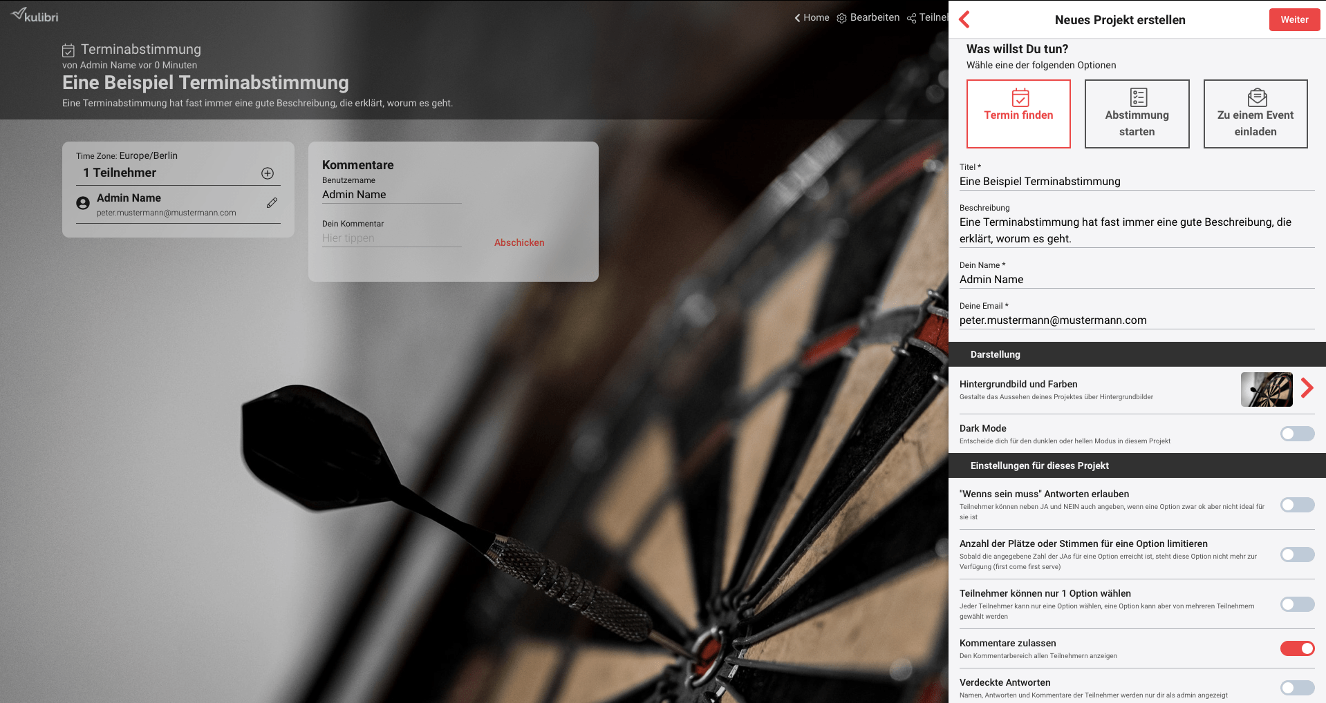
Start screen for admins
- The admin view is now a WYSIWYG editor. I.e. while editing on the right side, you can see changes in real time on the left side.
- The type selection is also done in WYSIWYG mode, so you can always see the differences between the types right away
- Many new settings
- “If need be” answers
- Limited number of votes per option (first come first serve)
- Only one option selectable (single choice)
- Hide the comment area
- Hidden mode (improved)
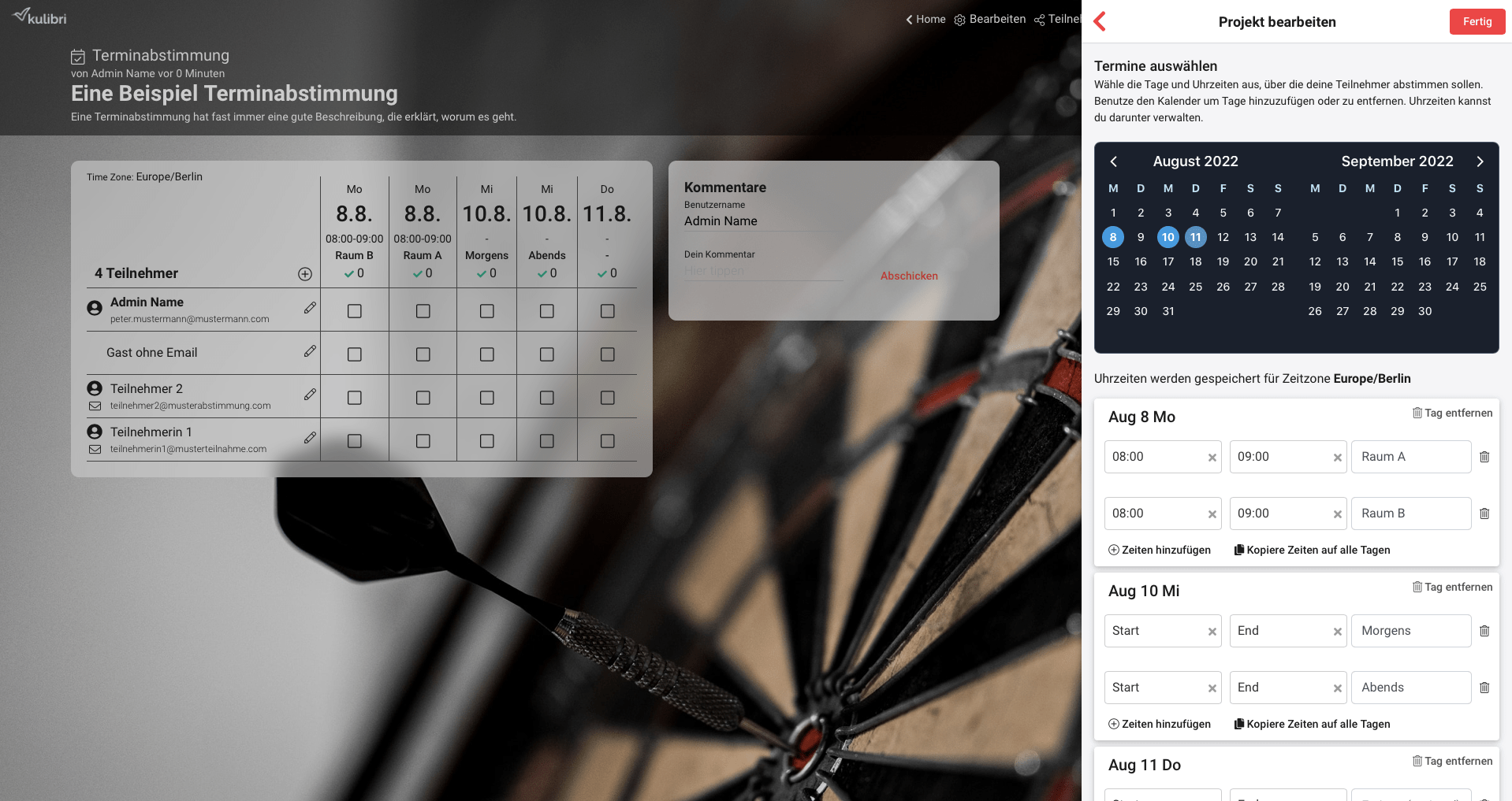
Editing of date options for admins
A lot has also been done in this area to provide more flexibility and convenience for our admins:
- Times and free text can also be combined. This makes it very easy to map e.g. rooms, teams, etc.
- Support of times and time zones (the old kulibri had interpreted these only as text)
- With the new copy function you can now transfer repeating times/teams etc. with one click to all other days
The new view on mobile devices
The support for mobile devices is completely new.
It is primarily optimized for the easiest and most comfortable use by the participants.


